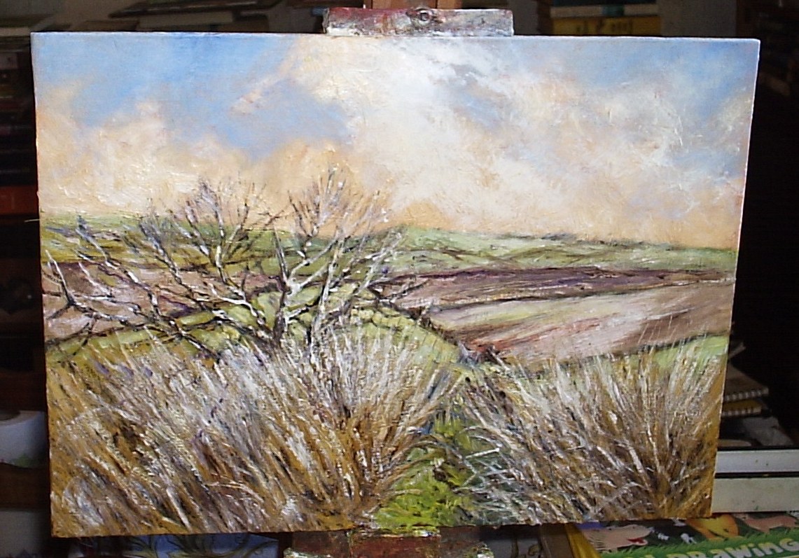
I confess that - while one's never satisfied - I'm not entirely displeased with this.
I watched a couple of painting demos on YouTube this evening - well, three. The first one was Bob Ross, quite an early film - from 1984, I think, when his technique was much less developed than it later became. I don't listen to Bob for painting advice - he had his technique, to fit into less than half an hour of TV time (which I certainly couldn't do, by the way), and mine is very different. But I do find him extremely calming - I get very wound up sometimes, and listening to him, and watching him, is oddly satisfying.
The other couple of demos were of paintings in Alkyd oils by one Michael James Smith - again, a totally different technique to mine, and I don't use Griffin Alkyds (by Winsor and Newton: when used with Liquin, especially, it's an extremely fast-drying paint). I was fascinated by his approach to painting trees - he lays down a dark substrate, a mix of Ivory Black, Ultramarine, Burnt Umber and so far as I can tell - the demos are somewhat snippety, and not helped by the music he uses to accompany them: I'm a bit too deaf to mask it out and hear all of the commentary; and I don't like the music, either, which doesn't help - a touch of Yellow Ochre and/or Winsor Lemon.
When he comes back the next day or for the next session, he applies a glaze of Liquin over the now more or less dry paint, and then with a quite small brush applies the leaves in a series of dancing strokes with lighter paint, and a quite small brush. I don't think I'd have the patience for that, although he has acquired a speedy technique; and the results look (on screen at least) very realistic. It approaches hyper-realism perhaps - not everyone's cup of tea; and I'm not keen on using black for the darks, even mixed with ultramarine. But if it works, it works.... later on, he introduces the likes of Cerulean Blue (Hue), Sap Green, and more Titanium White. Worth a look.
But in oil particularly, I prefer a more textured approach and am not overly-concerned with realism - I'm after the impression and the feel of a place; no reason why you can't get that with a very realistic approach, but it's something I find a little too painstaking - I'd be afraid of working a painting to death.
Anyway, here's my WIP (Work in Progress), an oil of a spot on St Catherine's Down, composed from my own sketches and a photograph by Barry Fitzgerald, my friend and professional photographer based in Tralee, Co. Kerry, in Ireland.
No comments:
Post a Comment